Every once in a while, I need to interact with forms on the web that go beyond simple login forms, like for example:
- password reset forms
- online shop checkout forms
- filter forms
- ticket shop checkout forms
- personal data settings pages
- sign-up forms
And almost every single time I wonder how people manage to interact with these forms without lots of question marks popping up or without getting frustrated. 🤯 Here comes a very sad story about forms on the web, problems I had when filling them out, and how I would fix these problems to make the web a better place…
Forms without labels
Due to aesthetic reasons (?), designers and developers tend to omit labels for input fields, generally resulting in severe accessibility (a11y) and user experience (UX) problems.
Example 1: updating my email address
I wanted to update my email address and navigated to the dedicated settings page. There, I was confronted with the following form:
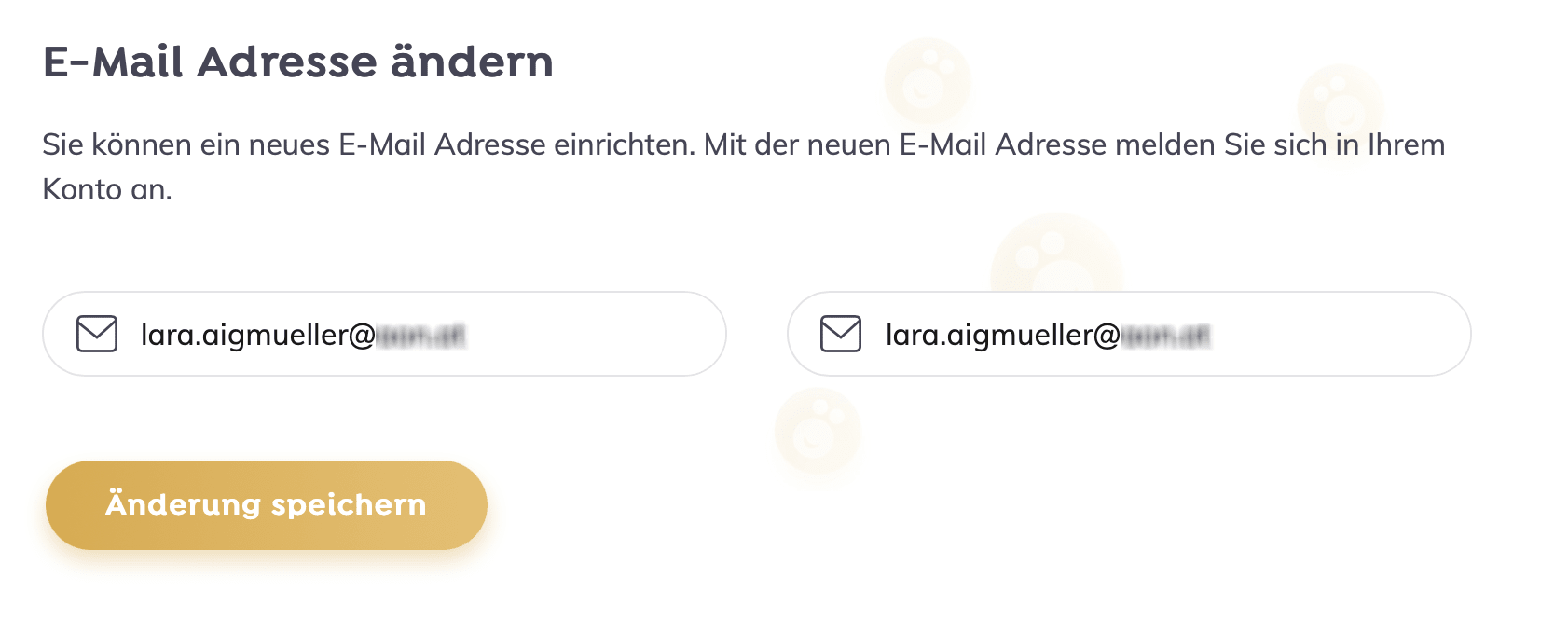
Apart from the grammatical errors, I was confused and unsure what to do with the two input fields containing the same value—my current email address. I had an idea of course… When deleting the values from the input fields, the following information was revealed:
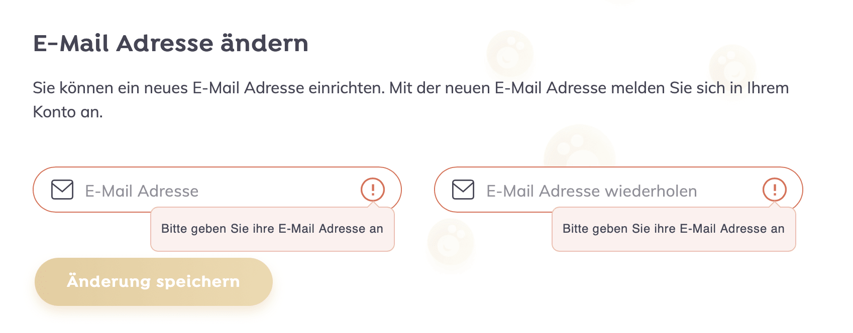
The inputs’ placeholder text told me: the first input field is the one where the (new) email address should be entered and the second one is there to repeat it. (To be perfectly sure that the address is spelled correctly. Which it was, because I copied and pasted it from the first to the second input field… 🙄)
Hey, and there’s one more typo in the error message text, but that’s another story.
Example 2: putting an apartment up for sale
I recently stumbled over a website where users can enter data about an apartment or house that should be sold by a real estate agent. It contains a form with a lot of input fields about the “renovation year”, “year of construction”, “floor number”, “floor space”, “number of rooms”, “number of bathrooms”, and so on… A lot of numbers. 🧮

And guess what—none of these inputs had labels, they only used placeholder text instead. This is what the form looked when filled out:
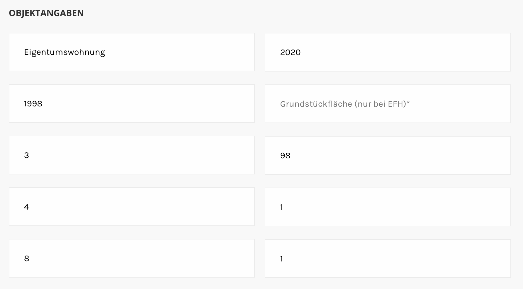
We end up with ten input fields, most of them containing numbers. Do you remember which field contains which information? 🤔 I don’t think so… And here we go again.
Problem and solution
A typical mistake was made in both examples: placeholder text was used instead of labels. And as we can see, one major problem is that placeholder text is not visible anymore as soon as a value is entered and the user needs to remember (or find out) what’s the label for the value. How to solve this?
Always use labels (and not placeholders) to specify what value is expected in an input field!
<label for="email">Email address</label>
<input id="email" type="email" name="email" />

<label for="email-repeat">Repeat email address</label>
<input id="email-repeat" type="email" name="email-repeat" />
There are tons of articles out there about this and the problem with placeholders in general. Here are a few:
- A placeholder is not a label by Manuel Matuzović on HTMHell
- Placeholders in Form Fields are Harmful by Katie Sherwin (Nielsen Norman Group)
- Don’t Use The Placeholder Attribute by Eric Bailey on Smashing Magazine
The user should not be forced to remember things. This is one key message of the “recognition rather than recall” usability heuristic by Jakob Nielsen (there are 10 usability heuristics in total) and related to the label vs. placeholder problem we can still find in so many forms on the web.
Bonus: same text color for values and placeholders
Here’s another form at the end of a checkout process where I needed to enter my address data:
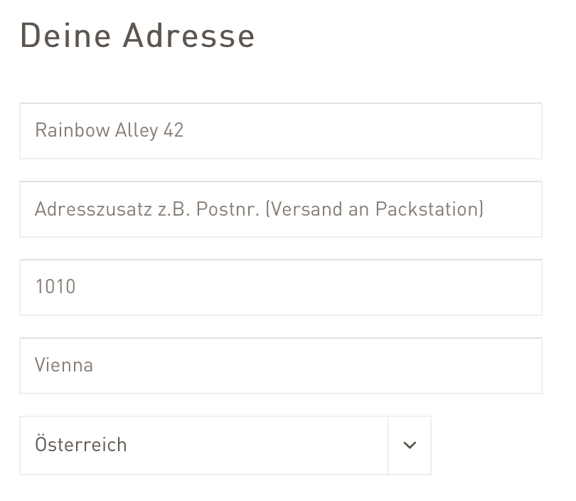
I faced the same problem again: placeholders are used instead of labels. On top of that, the text color for placeholders and the actual values is the same (and the contrast is rather bad), which makes it hard to distinguish between empty input fields and the ones already filled.
Forms with wrong labels
Wrong labels can also be a problem, especially for users relying on assistive technology like screen readers.
Example: birthday input
The following screenshot shows three select inputs to enter the date of birth. 🎂 The first one is to select the day, the second one to select the month, and the third one to select the year.
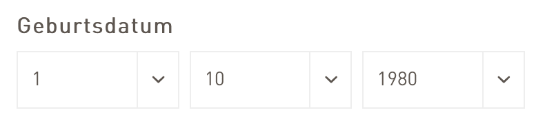
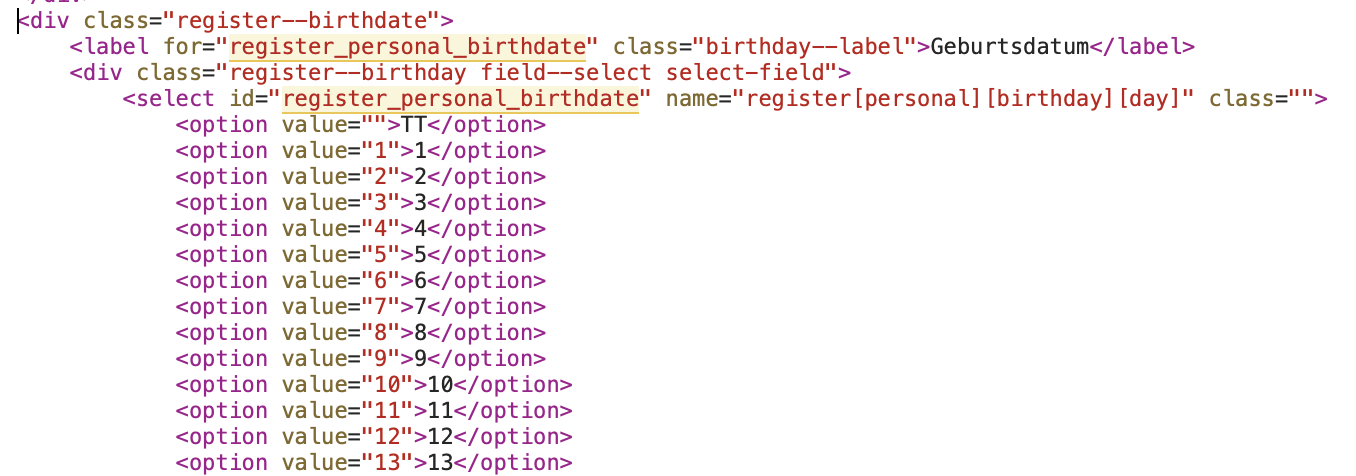
The code revealed that the label visible above these three selects (“Date of birth”) is only associated with the first select and the others don’t have any label at all. Visually it looks okay, but semantically there’s space for improvement here.
While using three selects for entering the date of birth is not terrible, we need to make sure that the labels are placed correctly.
Problem and solution
The problem with the birthday example is that the label is only associated with the first select input and the other two dropdowns don’t have a label at all. A possible solution would be to use a fieldset to group the input elements. This way the legend can be used to describe the group and each select gets its own label.
<fieldset>
  <legend>Date of birth</legend>
  <label for="day">Day</label>
  <select id="day" name="birthday[day]">
    <!-- options -->
  </select>

  <label for="month">Month</label>
  <select id="month" name="birthday[month]">
    <!-- options -->
  </select>

  <label for="year">Year</label>
  <select id="year" name="birthday[year]">
    <!-- options -->
  </select>
</fieldset>
Confusing error messages
I like strong passwords and never use passwords shorter than 32 characters. Except… when I’m not allowed to. I never really understand why some services limit the password length? 🤷♀️
The frustrating part of setting/changing the password is when the information about length and allowed characters is not available upfront or just wrong like in the following example.
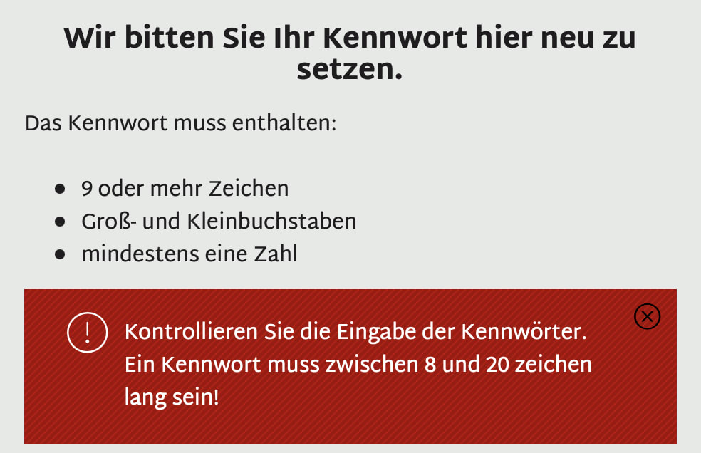
Example: (re)setting my password
The information I had before changing the password was: The password must consist of
- 9 or more characters
- uppercase and lowercase letters
- at least one number
After entering my (32 characters long) password, I got the following error message: “The password needs to have a length between 8 and 20 characters.” – Well, that’s not “9 or more”… 🙈
Problem and solution
The problem here is obvious: I had wrong information before changing the password. The solution?
Help the user preventing errors by providing correct and complete information.
Jakob Nielsen’s usability heuristic about “error prevention” contains useful tips—not only about password hints—that will help you improve forms on the web.
No error messages
Even worse than having contradicting information regarding errors is having no error message at all. 😢 This happened to me when I needed to enter my phone number in a form recently:
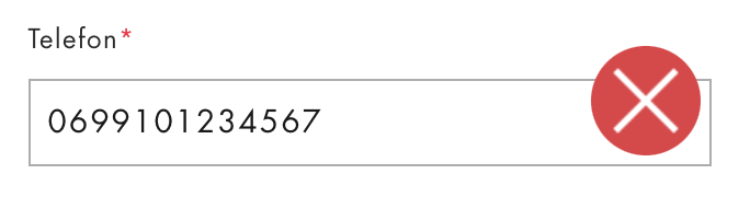
There was no hint about what’s the expected value. Again, I could only guess what the problem was and added the country code. Lucky me, I guessed right and I could submit the form.
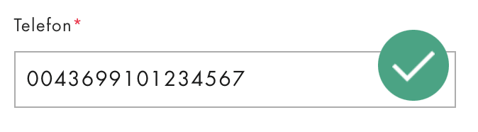
(Side note: I know that CSS is hard sometimes, but wouldn’t it look better to decrease the size of the icons so the circles are inside the input field? 👩🎨)
Problem and solution
When the validation of a certain form input fails, I want to know why and how I can fix the error. Jakob Nielsen suggests that a user should be able to recognize, diagnose, and recover from errors. I could see that there was an error, but I had to find out myself, what it was.
Provide hints about the expected formatting if necessary and provide understandable error messages to help users recover from errors.
Wrong tab order
There are a lot of reasons why users prefer using the keyboard for website navigation: some might be unable to use pointer or touch inputs due to a motoric impairment and others might just prefer using a keyboard, because they can work more efficiently this way. For all “keyboard users” out there, we developers should make sure that the tab order on a webpage is predictable.
Example: contact data form
This was not the case in the following contact form where the user needs to enter their first name, last name, phone number, and email address.
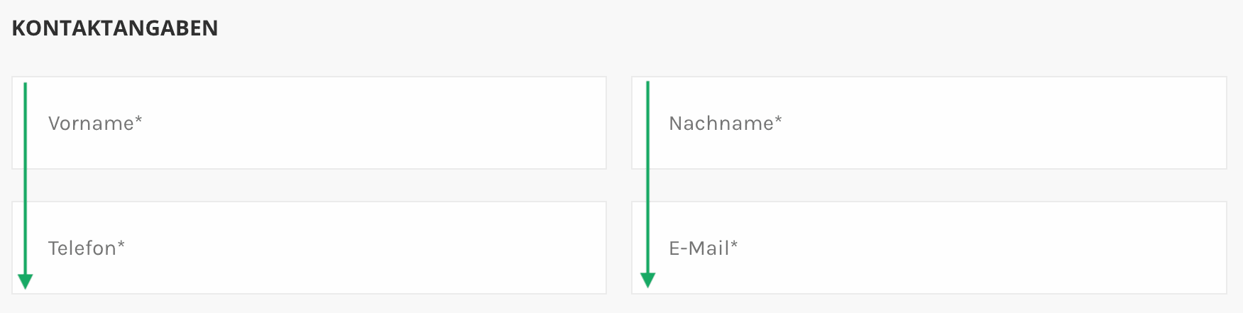
When using the keyboard, I jumped from “first name” to “phone number”, then to “last name” and then to “email address”, which didn’t make any sense, because I would expect to enter my last name after my first name.
Problem and solution
The problem when filling out the form quickly using the keyboard (because I’m already typing and it’s much faster to jump from one input field to the next using the tab key instead of switching to the mouse to select the next input field) is, that the user most likely enters their last name in the phone input field…
Make sure that the tab order in a form matches the user’s expectations by providing a logical HTML structure and keeping the form layout simple.
When input fields are sorted the right way in the HTML code, the tab order works by default without any necessary adjustments. Be careful when changing the visual representation with CSS using flex, grid, or multiple-column layout. I suggest to start designing the mobile version of a form layout first and when moving on to larger screens, evaluate whether it’s necessary to use a two-column layout at all.
Further reading:
Validation and assumptions
We developers love making assumptions about our users when, in fact, we shouldn’t. Often, this becomes a problem when it comes to form validation.
Example: validation of first and last name
One of my favorite discussions is whether to ask for a user’s first and last name (and sometimes middle name) separately instead of one single name input field and the validation for these values, like for example a minimum length.
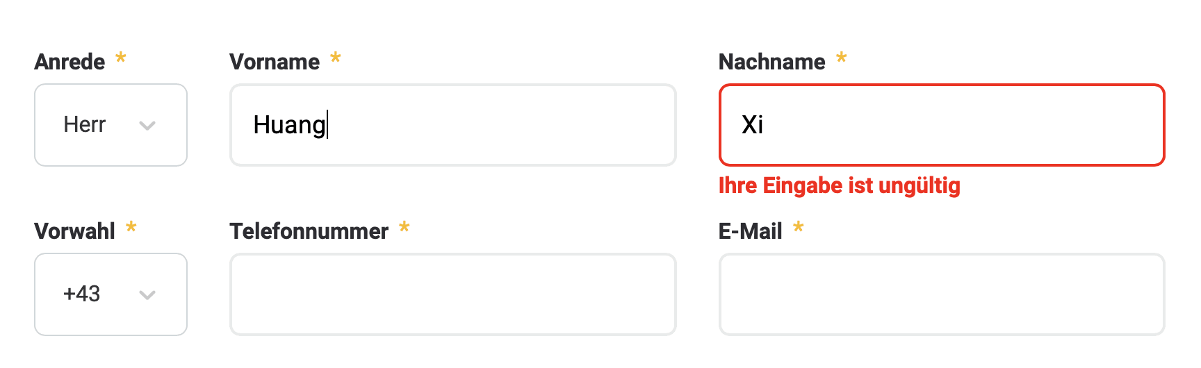
In the screenshot above, the user entered a last name consisting of two characters and the validation fails with a very unspecific error message: “The entered data is invalid.” — Well, thank you very much for the information. 🙄 Adding a few more letters let me find out that at least three characters were required in order for the validation to pass for the last name input field.
I’m lucky to have a first and last name of a certain minimum length, but sometimes, I run into problems when entering my name, because it contains an umlaut, like in the following form:
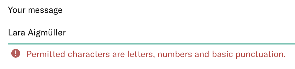
The error message says that only letters, numbers, and basic punctuation is allowed here. According to this, “ü” is not a letter. 🥲
Problem and solution
The problem: we base our form validations on wrong assumptions. The solution:
Be inclusive when validating forms and provide useful error messages.
I recommend reading the article “Dear developer, your assumptions are wrong” by Stefania Mellai that covers this topic and provides links to other useful resources.
Wrong input type
HTML provides a lot of different input types and elements for various use cases, so we developers should make use of them when appropriate.
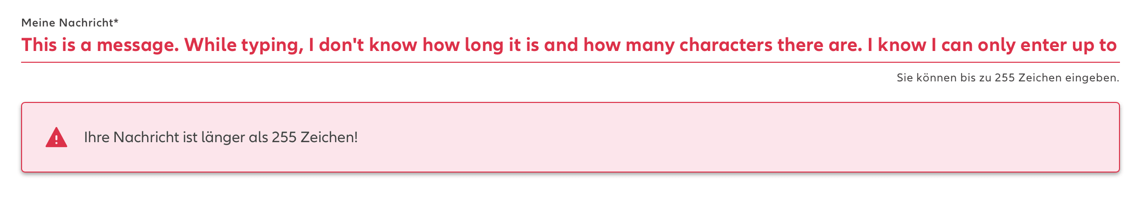
Example: text input instead of textarea
In a form I recently needed to fill out, there was a single line text input field labelled “My message”. Messages can sometimes contain more text than what would fit into a single line input. In this particular case, the hint text below the input says that up to 255 characters are allowed.

Problems and solution
Once I started typing I ran into two problems:
- I had no idea how many characters there are still left to write
- I could never see the whole message at once, but only the part I was currently writing and when moving the focus out of the field the beginning of the text, cut off when there was no space left anymore
When moving the focus to the next form field, the form validation told me that my message exceeded the maximum length of 255 characters. 🥲
In this example, I would use a textarea element instead of a text input. This makes it possible to always see the whole message and edit certain parts of it more easily. Additionally, let the user know how many characters they have left to write when the input length is limited. To summarize:
Use the appropriate HTML form elements and input types depending on the expected data and use cases. Help the user preventing errors by providing the information they need.
Unfortunately, there is more…
Every once in a while, I stumble upon more bad forms, frustrating user experiences, useless error messages (if any), and forms that just don’t work at all. Sometimes, I need to open the developer tools in my browser to find out what’s the problem and occasionally, this actually helps me to figure out what’s wrong. 🎉 (But this should not be the only way…)
In such cases, I’m asking myself whether these forms have been tested at all! What would other people (ones with less technical background) do? Do they run into the same problems? If yes, this must lead to sales losses (checkout process not working), users not being able to register (no new customers), and so on… Aren’t the pain points large enough to fix these issues and improve usability and accessibility in forms?
This was the first installment of my personal “WTF moments” collected during my journeys through the interactive World Wide Web. Since this a11y/UX madness never seems to stop, maybe one of these days, I’m going to write a follow-up post on this one. 🙃