Adding styles for an element’s hover state is easy with CSS. For example, this is how you can update the font color of a link when the user moves the mouse over the element:
a {
  color: darkblue;
}

a:hover {
  color: rebeccapurple;
}
Adding the pseudo class :hover to the CSS selector does the trick.
With some additional CSS skills, you can create much more fancy hover styles, including animation and more. Not all of your creativeness might be taken well by your users, though.
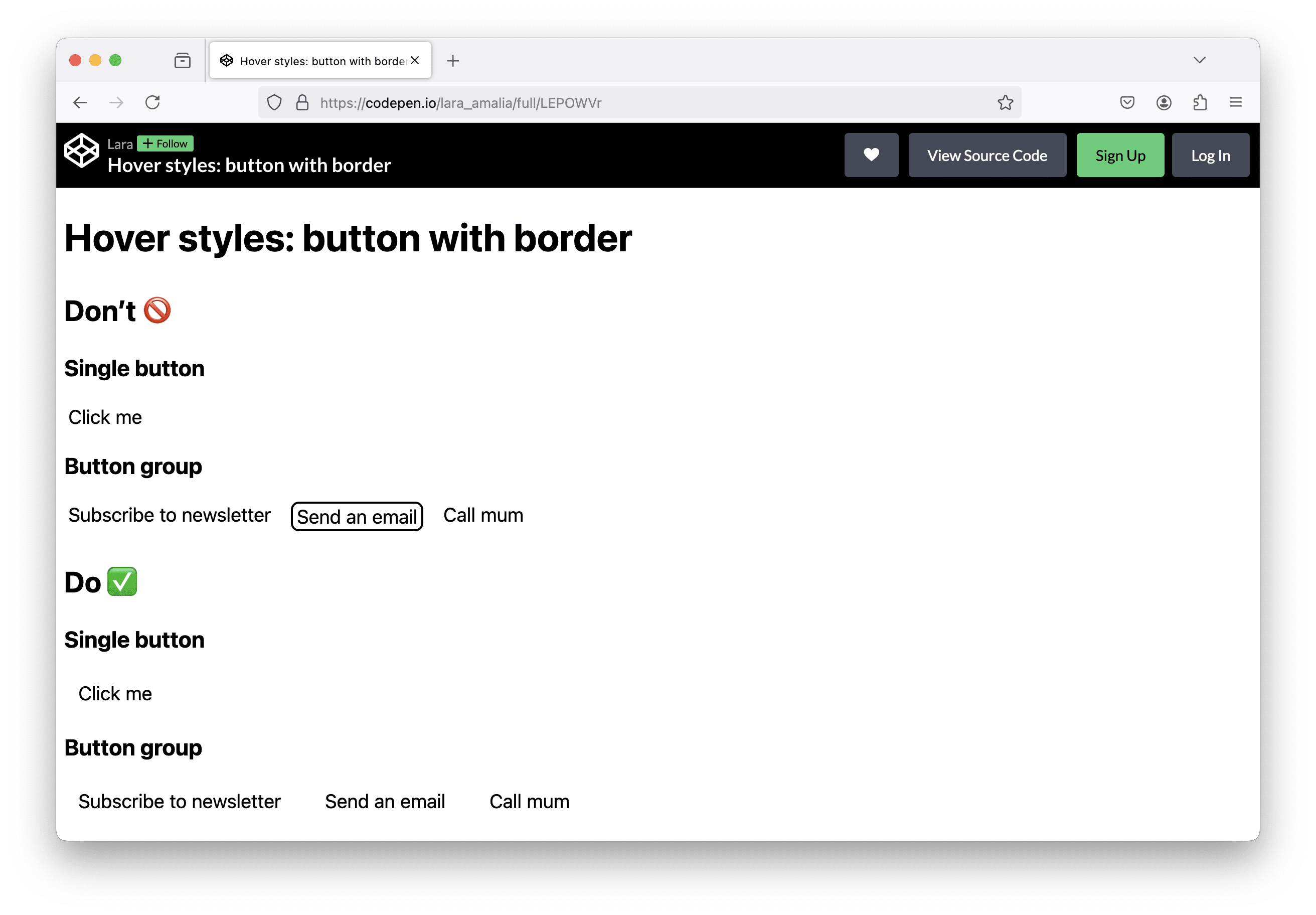
Adding a border on hover
When an element, e.g. a button, gets a border on hover that wasn’t there before, it gets larger when the user moves the mouse over the element. This can result in unwanted layout shifts and elements jumping around…

To solve this problem, make sure that all required additional pixels for the hover styles (for padding or border) are already "reserved". If you don’t want your button to have a border in its default state, set the border-color to transparent, so the border is already there but not yet visible.
Here’s the final code snippet:
<button>
  Click me
</button>
button {
  border: 2px solid transparent;
  border-radius: 8px;
  padding: 4px 12px;
}

button:hover {
  border-color: inherit;
}
Sidenote: by using the inherit keyword, the button’s border color will be the same as the text color.
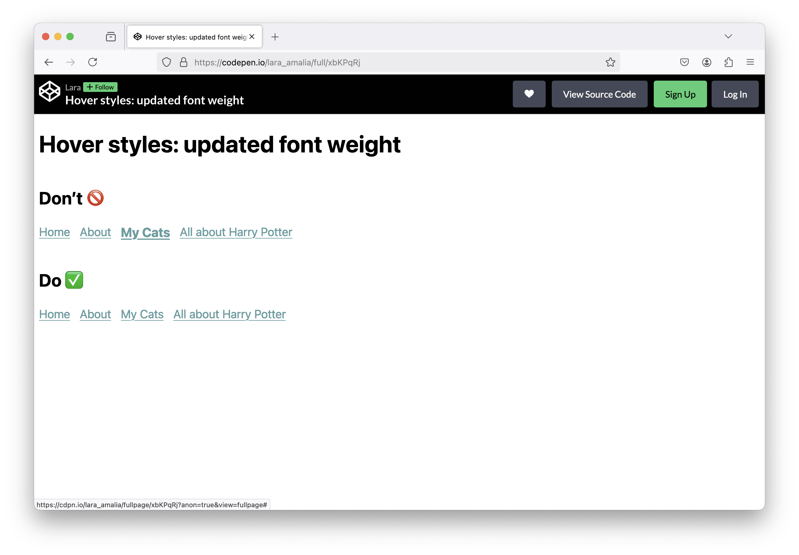
Changing the font weight on hover
A hover style I see every once in a while is a changing font weight or font size (or even both 😱). Here we have a similar problem as described above. The text gets bigger (or smaller) on hover and results in elements moving around because the layout is updated.

In order to avoid this, I would suggest to find other CSS properties to change on hover, for example the text color or the background color.
There are solutions if you still want to update the font weight: Chris Coyer wrote an article about "Bold on hover… Without the Layout Shift".
Nested hover styles
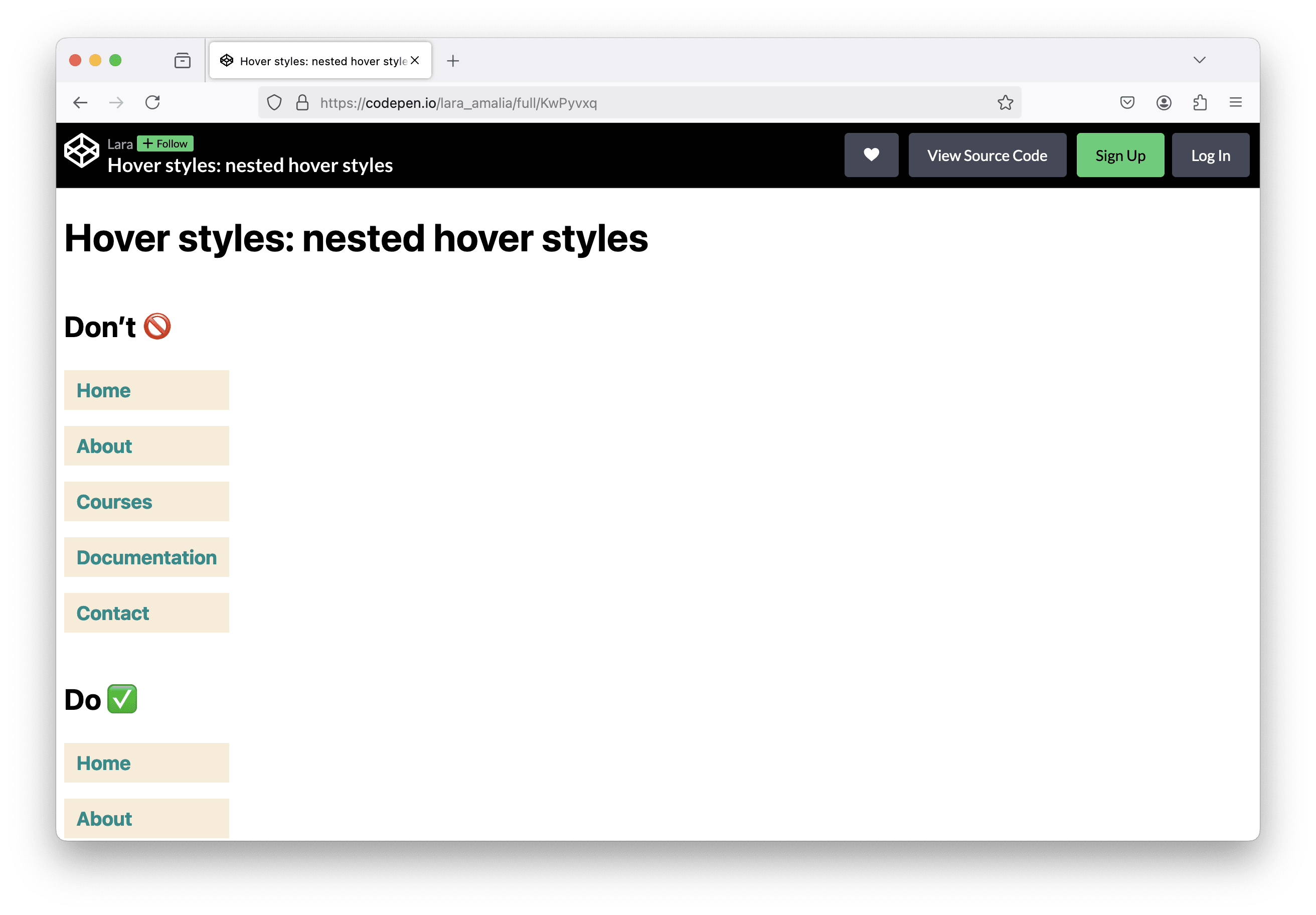
Depending on your HTML code structure, you can also run into the issue of having multiple nested hover styles. I always get confused when the style changes, but I didn’t yet reach the interactive element itself. Let me show you what I mean in this example on CodePen.

There is a navigation with some nav items in form of an unordered list. Each list item holds a link. Imagine a large project, where the <a> element is already styled and these base styles are overwritten for links in the navigation.
Additionally, there are styles for the <li> element wrapping the anchor. The developer starts overwriting hover styles for <a>, later adds some additional styling for the list and the list item…
At some point, there are hover styles defined for both the actual link and the wrapping list item.
This results in the problem, that when the user moves the mouse cursor over the <li> item, some styles already change and the user might think that now, they can click and follow the link. Actually, they need to move the cursor over the <a> element and click to trigger the navigation.
My solution in this case would be to add styles and hover styles only to the <a> element itself. This way, the styling only changes when the user already reached the anchor element with their mouse. By adding some padding, the click area becomes larger and is easier to reach, which is a small accessibility plus.
Details matter
As you can see, it’s often the little details that change the overall design and user experience. Reach out to me on Mastodon and let me know if you know similar examples.
Check out our RSS feed and never miss a scale blog post! 🙂