So here we are: after a long time, I finally reached the last (bonus) article of my web development basics tutorial series. Initially, my idea was to finish all 12 articles I had planned within one year. Well, it took me more than four. 🙃
Good things come to those who wait. ⏳
In the end, I want to change some bits and pieces of the small tutorial website and improve the design even more. There’s never been a website I’ve built during my career I considered to be “done” or “finished”… There’s always something to improve, because it might be that I learned new things and the web platform constantly evolves. Then, there are times when a redesign needs to be done because the website or app looks outdated.
When it comes to our small example website we built together during this tutorial series, there are some minor things, I’d like to update to, let’s call it, finalize the project.
You can find the code of each step of this tutorial on GitHub.
Final design improvements
I am going to look at the website from top to bottom and clean up a bit while improving the design even more. Let’s open the index.html file in a browser and activate the developer tools. I reduce the viewport size, because I want to check out the mobile layout first.
Navigation
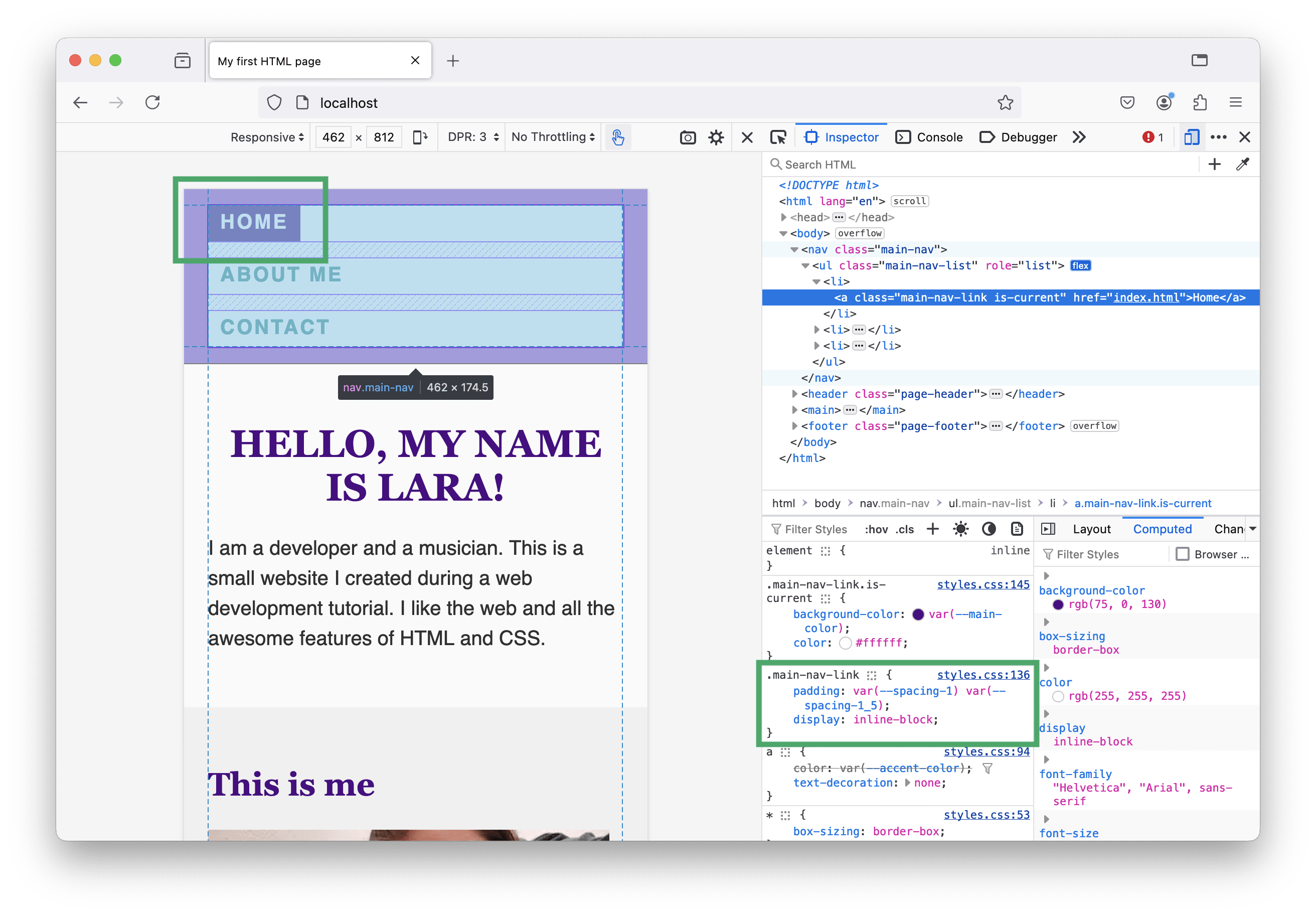
On smaller viewports, when the navigation items are listed in column direction, I’d like to have a little more space between the items now we’ve added a background for active items in the last part of the tutorial. Additionally, something looks off… the list items somehow ignore the navigation’s padding and are placed too close to the top of the viewport. 🤔 Let’s have a look.
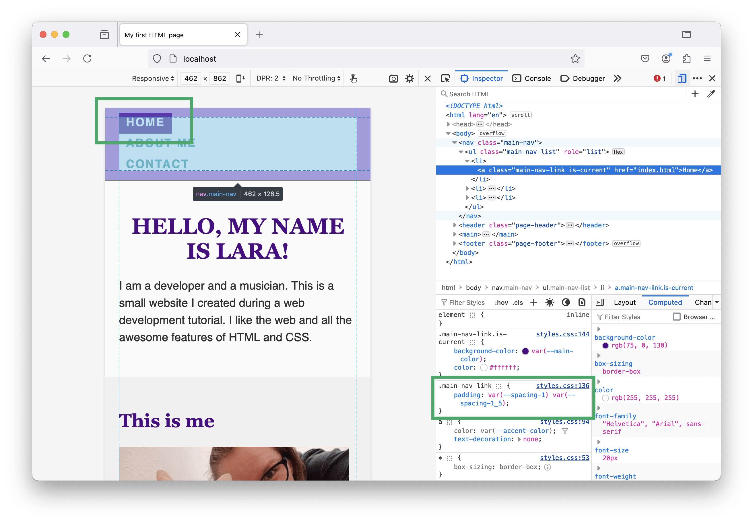
Last time, we’ve added padding to the <a> elements. The thing is that links are inline elements (you remember the CSS box model?) and padding-block-start/padding-block-end don’t affect their surrounding elements. Therefore, I change the links’ display property to inline-block and tada… 🎉 This is what I want the navigation to look.
Maybe you can’t see it, but if you look closely, you realize that the text within the colored box is not perfectly centered. Even if we use the same padding on top and bottom, there is more space between the text and the end of the box at the bottom than at the top. 😬
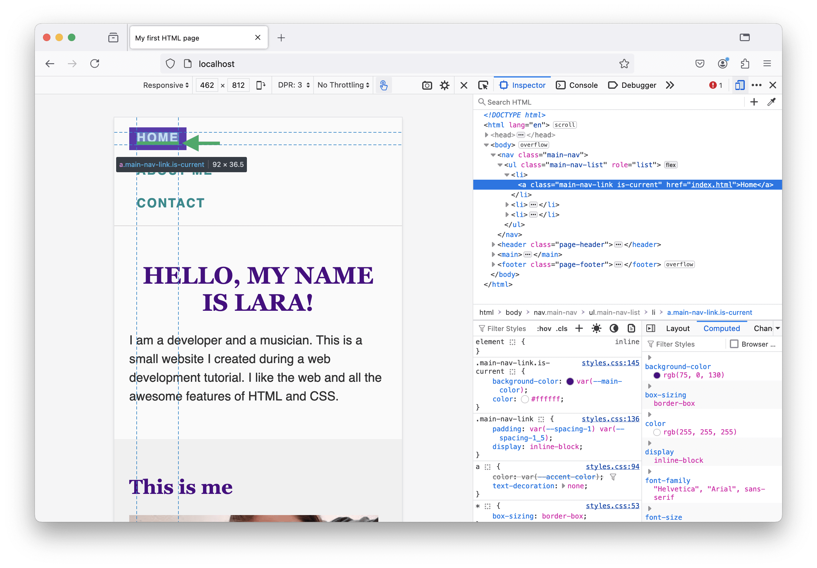
This is the result of using uppercase text. There is additional space below the letters for descenders (needed for lowercase letters like “g”, “p” or “y”). In order to fix this, I am going to add a few extra padding-pixels on top. Here’s my updated CSS code for the navigation links:
.main-nav-link {
 --padding-block: var(--spacing-1);
 padding: var(--padding-block) var(--spacing-1_5);
 padding-block-start: calc(var(--padding-block) + 4px);
 display: inline-block;
}
Section headlines
Headings usually come with margin at the top and bottom. This is due to the user agent stylesheet—styles defined by the browser.
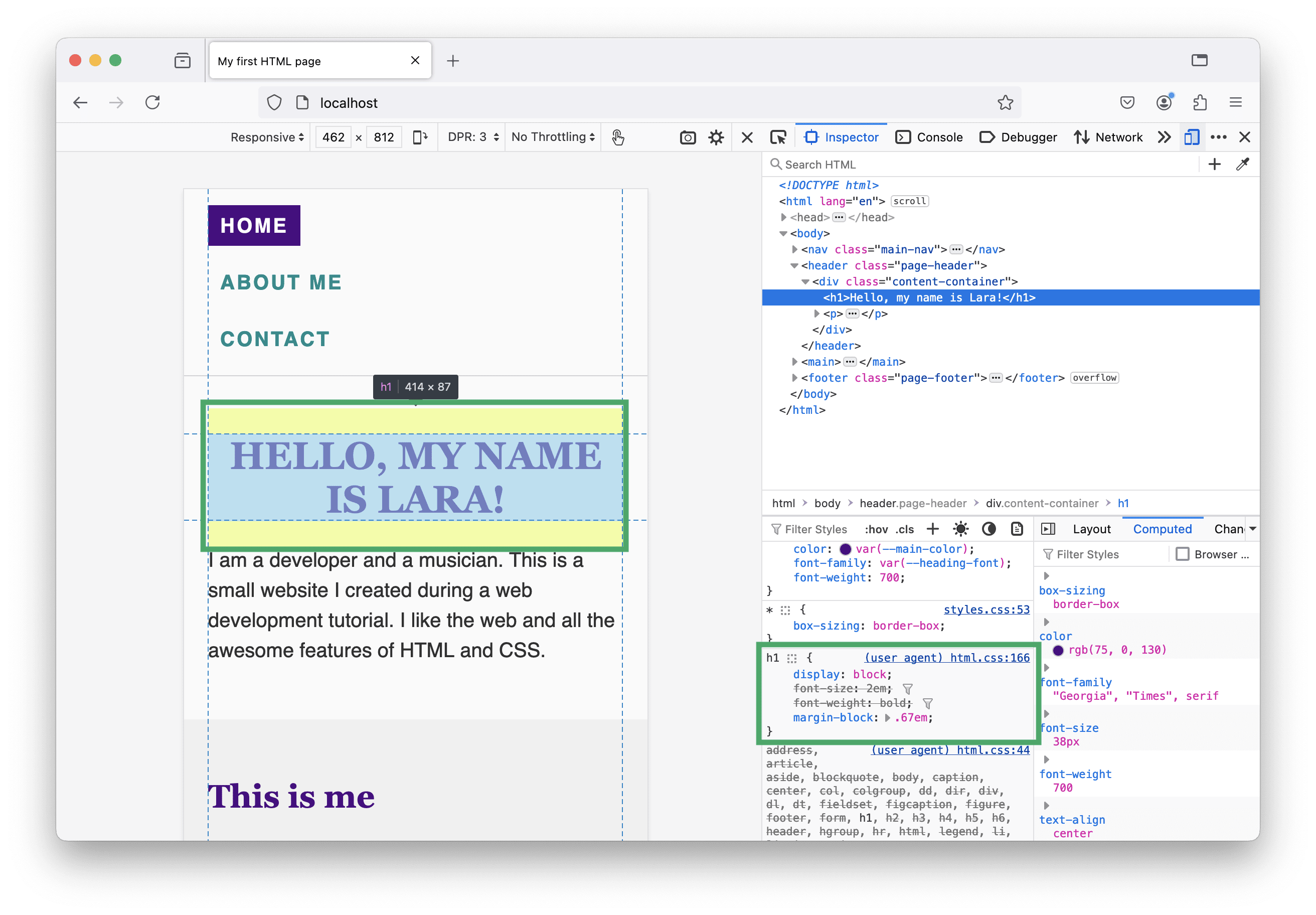
This makes perfect sense. Without any CSS code coming from the author (this is us, the developers), well-structured text in an HTML file is readable and there is space between headlines, paragraphs, lists, and so on…
However, as soon as we start designing and add our own CSS, these margins might get in our way. Often, I want headlines that are the first elements of a section have no margin-top at all, because I usually handle the distance to content before adjusting the section’s padding. The margin-bottom is fine, because there should be some space between the headline and the text that follows. Here is how I update my CSS:
:is(h1, h2, h3, h4):first-child {
  margin-block-start: 0;
}
The :is function is useful here, because I can save some lines of code. It’s the same as if I would write:
h1:first-child,
h2:first-child,
h3:first-child,
h4:first-child {
  margin-block-start: 0;
}
The :first-child pseudo-class selector selects the first element of a group of siblings. It depends on your HTML code structure if this is what you want, but for our tutorial website, it has the desired effect. We select the site titles as well as the section headlines as they are always the first children of the content-container element.
<div class="content-container">
	<h1>Hello, my name is Lara!</h1>
	<!-- more content -->
</div>

<section>
  <div class="content-container">
  	<h2>My projects</h2>
  	<!-- more content -->
  </div>
</section>
Multi-column layout
Let’s move on to the next problem: the multi-column layout obviously doesn’t look good on small viewports.
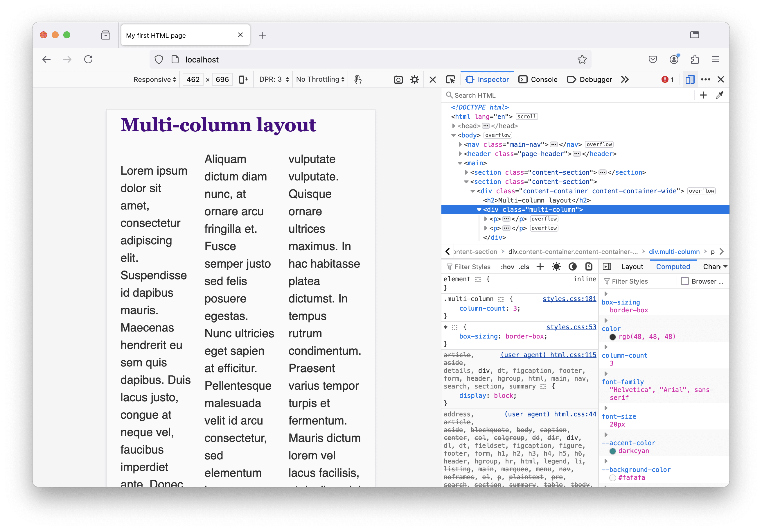
The CSS rule has to move inside a media query block. To find the perfect breakpoint, I resize the viewport using the browser’s developer tools until I have the feeling that more columns would fit and are readable. Here’s my CSS update:
/* I deleted the following: */
.multi-column {
  column-count: 3;
}

/* And added the following: */
@media screen and (min-width: 750px) {
  .multi-column {
    column-count: 2;
  }
}

@media screen and (min-width: 900px) {
  .multi-column {
    column-count: 3;
  }
}
There’s one more thing, I want to improve: When there are two or three columns, the first column’s first line is not aligned with the second column.
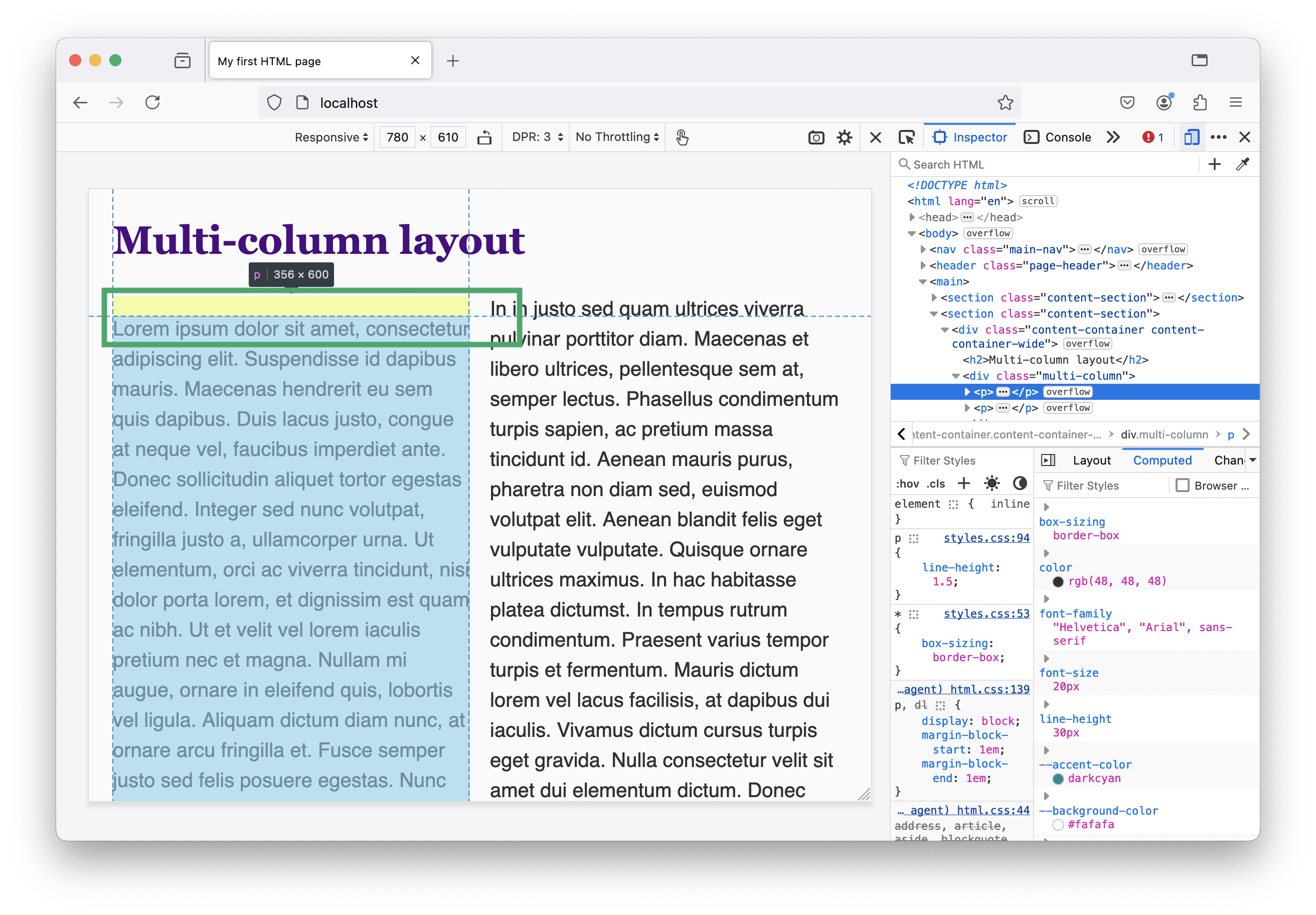
This is caused by the same “problem” we had with the headlines before. Also paragraph elements have a margin-block property set by the user agent stylesheet. This is how I fix it:
.multi-column :first-child {
  margin-block-start: 0;
}
Note the space between the first and second selector! I don’t want to select the element with the .multi-column class itself, but its first child element.
Text and image blocks
When looking at the about page and increasing the viewport size so the images and texts are displayed next to each other, I get a déjà vu (“the phenomenon of feeling as though one has lived through the present situation before”, see Wikipedia for details).
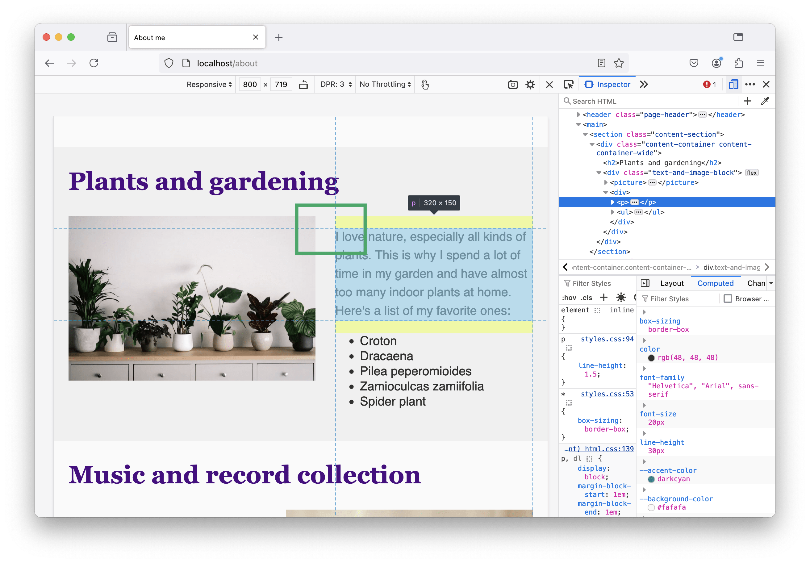
I need to adjust my HTML and CSS code to fix this. Here’s how:
<div class="text-and-image-block">
  <!-- picture/img -->
  <div class="text">
    <!-- text content -->
  </div>
</div>
@media screen and (min-width: 800px) {
  .text-and-image-block .text :first-child {
    margin-block-start: 0;
  }
}
Hover states
Interactive elements—like input fields, buttons, and links—on our contact page have a hover state that can be styled.
Links
We didn’t add hover styles for links yet. There are two of them in the contact data section I want to update. First, the links are pretty close, so on touch devices it could happen that the user accidentally clicks the wrong one. I improve this by adding a little space between them.
<a href="mailto:lara@scale.at" class="contact-link">lara@scale.at</a><br />
<a href="tel:+4369901234567" class="contact-link">+43 699 01 234 567</a>
.contact-link {
  display: inline-block;
  margin-block: var(--spacing-1);
}
Second, when the user hovers over the links, there’s currently no indicator except the changing mouse cursor. I want the links to change their color on hover and update my CSS file for that. In the code snippet below you can see all my additions:
:root {
  --accent-color-dark: #004c4d;
}

@media (prefers-color-scheme: dark) {
  :root {
    --accent-color-dark: #008585;
  }
}

a:hover {
  color: var(--accent-color-dark);
}
Transitions
All our hover states became styled—it’s all about changing colors: the border-color of the input fields, the background-color of the form’s submit button and the text color of the link.
When a user moves their mouse over one of these elements, the color changes immediately. It would look more elegant if this change weren’t abrupt but rather a smooth transition between the normal and the hover state. In CSS, there is the transition shorthand property we can use for that.
a {
  color: var(--accent-color);
  text-decoration: none;
  transition: color var(--transition-duration);
}
In the code snippet above, I add the transition property to the CSS rule that styles our links. The first value is the CSS property that should be animated and the second value is the duration of the animation. Because I want all hover transitions to have the same duration, I added a custom property --transition-duration: 150ms; to the :root rule block at the top of my CSS file.
Let’s update all other elements with a hover state as well:
.main-nav-link {
  transition: color var(--transition-duration), background-color var(--transition-duration);
}

.contact-form input,
.contact-form textarea {
  transition: border-color var(--transition-duration);
}

.contact-form [type="submit"] {
  transition: color var(--transition-duration), background-color var(--transition-duration), border-color var(--transition-duration);
}
Note that I can add multiple properties to the transition declaration by separating them with a comma.
Validation
The styling adjustments we made are minor, and some of them probably don’t get noticed at all by a lot of people. I strongly believe that details matter, and it’s often the little things that make a huge difference and show that we put effort and love into our tutorial website. ❤️
Without telling you, I made some more tiny adjustments to the HTML and CSS code.
You can find the final code of the tutorial website on GitHub. Go to repository.
I also checked each HTML file once more with the W3C Validator. This helps to find mistakes in the markup and provides useful tips and insights, so it’s worth it!
Further reading
To wrap up this web development basics tutorial, I’d like to share some of my favorite articles and resources on the web, about the web.
“CSS on the other hand works in a place that can never be fully controlled, so it has to be flexible by default. It’s less about ‘programming the appearance’ and more about translating a design into a set of rules that communicate the intent behind it. Leave enough room, and the browser will do the heavy lifting for you.”
– from The CSS Mindset by Max Böck
“You won’t find any code in here to help you build better websites. But you will find ideas and approaches. Ideas are more resilient than code. I’ve tried to combine the most resilient ideas from the history of web design into an approach for building the websites of the future.”
– from Resilient Web Design by Jeremy Keith
“Give the browser some solid rules and hints, then let it make the right decisions for the people that visit it, based on their device, connection quality and capabilities. This is how they will get a genuinely great user experience, rather than a fragmented, broken one.”
– from Be The Browser’s Mentor, Not Its Micromanager by Andy Bell
“For much of CSS, you don’t need to worry about learning properties and values by heart. You can look them up when you need them. However, there are some key underpinnings of the language, without which you will struggle to make sense of it. It really is worth dedicating some time to making sure you understand these things, as it will save you a lot of time and frustration in the long run.”
– from How To Learn CSS by Rachel Andrew
“Platform differences make it impossible to hit ‘true’ pixel-perfection, but in practice, this isn't a big deal. We can't guarantee a universal consistency, but we can ensure that each experience is internally consistent, and is faithful to the spirit of the design. That's the most important thing.”
– from Chasing the Pixel-Perfect Dream by Josh W. Comeau
“Design is highly technical. Some will view this as a demand that designers who design for the web should learn to code, but I don't necessarily think that's true. What I think this means is that design requires a deep understanding of a subject.”
– from It's 2023, here is why your web design sucks. by Heather Buchel
Websites and blogs worth checking out
Ready for another HTML tutorial? Blake Watson just recently published HTML for people—a tutorial about building websites with HTML, about how to publish your website, and more.
“I created this web book because I wanted something for people who don’t consider themselves professional web developers. [...] This book is aimed at people who have no prior coding experience of any kind.”
Una Kravets talks and writes a lot about CSS, HTML and web design in general. I can recommend watching her “Designing in the Browser” videos, which are suited for beginners.
I enjoy reading articles (and listen to talks) by Rachel Andrew and Miriam Suzanne. Both know the ins and outs of CSS because they are literally working on the CSS specification. They write great content about the inner workings of CSS (layouts, the cascade, and more…) on their personal blogs rachelandrew.co.uk and www.miriamsuzanne.com.
In HTML, so many things can go wrong. And they do. On production websites. On HTMHell Manuel Matuzović collects code snippets that are funny and sad at the same time. And I know from a confidential source there will be another edition of the HTMHell advent calendar this year.
On his site Defensive CSS Ahmad Shadeed shares useful CSS code snippets that make your designs more robust and future-proof.
“It turned out that defensive CSS doesn't only apply to CSS, but UI design as well. As a designer, you need to either work on visual variations of a component with all the possible use-cases or at least communicate them clearly with the development team.”
As the author of the book “Atomic Design”, Brad Frost has a lot of knowledge about web design, design systems and front-end development. He shares interesting thoughts around the web development field and also articles from other authors on his blog.
Josh W. Comeau creates awesome interactive tutorials and provides great articles about CSS, animation on the web, and more…. Additionally, he is the author of two extensive interactive courses about CSS and React. Many articles go into details, but he always starts with the basics and provides demos that really help understanding even complex topics.
Do you want to know more about (web) typography? Then, I can recommend Pimp my type by Oliver Schöndorfer.
Of course, there are more people I follow on Mastodon, blogs I visit regularly, and other inspiration on the web… I try to update a list of web resources on GitHub every once in a while in case you’re interested in even more reading material.
Closing remarks
Congratulations, you’ve made it through my tutorial (or at least its last article)! 🥳 Thanks for staying until the end and sorry, that it took longer than initially planned.
Thanks to all the people who supported me during the last couple of years—work colleagues and mentors who taught me a lot of the things that are now part of this tutorial, other web developers and people I follow on social media who inspired me with their content I could learn from, and last but not least, family and friends, above all @felixh10r who proofread all my articles. ❤️
Contact me via the contact form on our website or on Mastodon (@lara_amalia) when you have feedback, questions, or anything else on you mind you’d like to share with me—I’m looking forward to it!