Hey there, it’s me again. It’s been a while, and I just realized that I published the last article in my web development basics tutorial by the end of 2023… 😱 Life somehow got in the way.
Today, I’d like to share basics about user experience (UX) and add some final touches to our tutorial website, which can be found on GitHub.
What is user experience?
When you do something, you either like it or not, so the experience you have is good or not. Imagine, buying a ticket for a train: you could go to a ticket counter, use a ticket machine, or buy the ticket online using a website or app. I guess the user experience you will have varies depending on the situation and mood you’re in and the option you choose. User experience is very subjective. It depends on your knowledge (did you use that ticket app before?), whether you’re in a hurry, whether the internet connection is reliable, and many other factors.
Nonetheless, there are some “golden rules” of user experience—facts which are universal, battle-tested, learned throughout the years by observing many different users and general user studies.
When you optimize your websites, web apps, or any other type of product according to these principles, your users are likely to enjoy using them and happy users should always be our goal. 😊
How to create good user experience?
Now that we know that caring for good user experience is fundamental to create successful products, the question is: “How can we do that?”
Here is a list of thoughts I always have in mind when working on a website’s or app’s user experience:
- Focus on your users’ needs: Do I solve a problem or does it just look fancy, without adding value for the user? (“It would be cool…” is not a requirement!)
- Care about the content: Write text in a way many people can understand and add semantic features to your product.
- Make your product accessible: Don’t assume that users can use all their senses at all times and provide alternatives for users with disabilities. (We’re going to talk about this in more detail soon.)
- Provide a good design: Be consistent and reuse patterns and components. Less is more!
- Don’t assume that everyone uses your product like you do: Avoid making (wrong) assumptions about your users based on your own experiences!
There are many areas of the web development field that are related to user experience. I will cover four of them in this article:
- usability
- performance
- accessibility
- design
Usability
The terms UX and usability are sometimes used as synonyms. I would say that usability is part of UX, but UX is much more than just that.
How usable a product is can be tested and measured. Here is a short Usability 101 by NNgroup explaining how usability is defined by 5 quality components: learnability, efficiency, memorability, errors and satisfaction.
I like to go through Jacob Nielsen’s usability heuristics from 1994 every now and then, as they are still relevant today.
When we look at our small tutorial website, we can find some parts that are good already, according to these heuristics: The design is minimalistic (no. 8), the navigation is on top where users would expect it as most other websites place it there too (no. 4), the content is understandable (except maybe for the placeholder text 😉) and well-structured (no. 2).
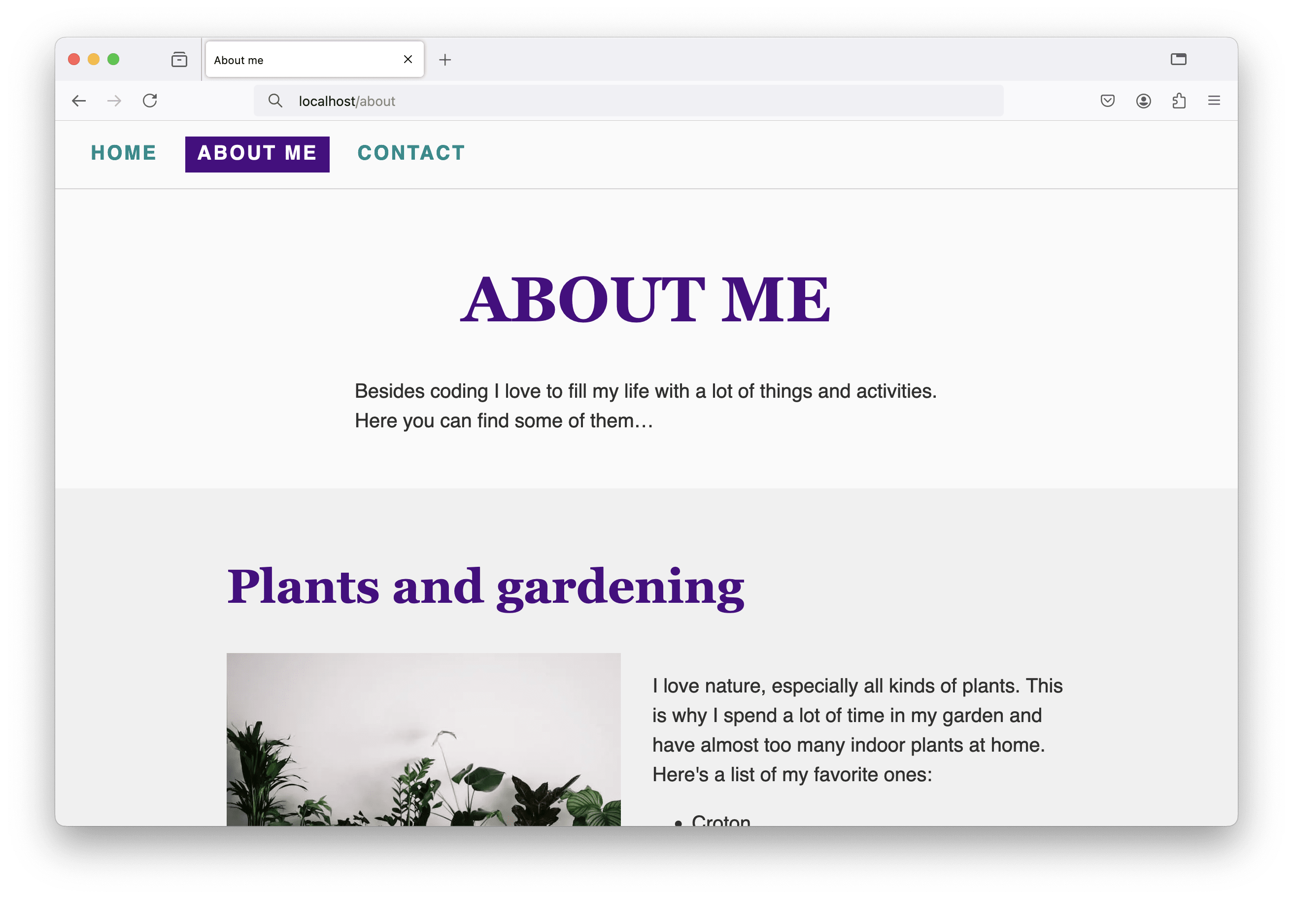
However, I found a problem with the navigation: we don’t highlight the page the user is currently on, which violates heuristic no. 1 “Visibility of System Status”. Let’s fix that! 💪
Go to the code of your tutorial website, or, in case you can’t find it anymore after this long time, check out the repository on GitHub including code for all parts of this tutorial and grab the folder from the last tutorial.
Open the index.html file in a code editor and view the page in a browser. Look for the <nav>, it should be at the very top of the page. There we have our three entries, one for each page. We are going to add an is-current class to the current navigation item, so for the index page the code is updated as follows:
<nav class="main-nav">
  <a href="index.html" class="main-nav-link is-current">Home</a>
  <a href="about.html" class="main-nav-link">About me </a>
  <a href="contact.html" class="main-nav-link">Contact</a>
</nav>
And in the about.html file we update the navigation like this:
<nav class="main-nav">
  <a href="index.html" class="main-nav-link">Home</a>
  <a href="about.html" class="main-nav-link is-current">About me </a>
  <a href="contact.html" class="main-nav-link">Contact</a>
</nav>
I guess, you know what happens in the contact.html file.
Now, we need to add some styles, so we highlight the currently selected navigation entry. You can be creative or use the code, I wrote (I added some styling for the link’s hover state as well):
.main-nav-link {
  padding: var(--spacing-1) var(--spacing-1_5);
}

.main-nav-link:hover {
  background-color: var(--background-color-variant);
}

.main-nav-link.is-current {
  background-color: var(--main-color);
  color: #ffffff;
}
And here’s how it looks in the browser:
Performance
We briefly talked about performance when adding responsive images to our website. Good performance is a crucial part of good user experience—or do you like waiting seconds for content to load or actions to complete…?
(A short side note: especially when actions take a bit longer, think about the heuristic “Visibility of System Status” again. Disabled buttons, loading bars/spinners, and other elements help the user while they are waiting for something and provide feedback that the application is working and not crashed. 😉)
When websites get bigger and applications more complex, when they rely on data that needs to be fetched from somewhere else, or when they are built upon JavaScript-heavy web frameworks, you need to start dealing with performance sooner or later.
Instead of going into details here, I’d like to share performance quick wins collected by Vitaly Friedman from Smashing Magazine. Below the list, there’s the option to download a performance checklist. Not all entries will be relevant at all times, it always depends on the size of your project, but it’s a good place to start and get ideas about what can be optimized.
A talk by Harry Roberts I enjoyed watching is called “Get your ‘head’ straight” and is about what can go wrong between the <head> and </head> tags in your HTML document when it comes to performance, and how to fix it.
Accessibility
Tim Berners-Lee, the inventor of the World Wide Web, once said:
“The power of the Web is in its universality. Access by everyone regardless of disability is an essential aspect.”
It’s important, to build inclusive websites and applications to make them accessible for and usable by people from different backgrounds, cultures, with different knowledge, and people with disabilities.
Throughout the tutorial, I mentioned accessibility (a11y) more than once, because this is nothing that should be built on top at the end of the development phase, but should be part of the whole process. Here’s what we already know from previous tutorial articles:
- The order of headlines is important (see Let’s Get Started With Web Development)
- Provide alternative texts for icons, images, and videos (see Let’s Get Started With Web Development and Responsive Images with HTML)
- Semantic HTML tags define landmarks that can be used by assistive technologies to navigate the page (see Building a Small Website – First Steps)
- Provide labels for input fields (see Creating an Accessible Contact Form in HTML)
- Accessibility and UX basics are summarized in its own section named A word about accessibility and UX in the article about HTML forms.
- Let the user choose their preferred base font size (see Building Responsive Websites)
- Use ARIA labels when native HTML doesn’t support certain features (see A Responsive Form Layout with CSS Grid)
- Provide good color contrast between text and background (see Creating a Dark Theme Using CSS Custom Properties)
That’s a lot already! 🥳 Unfortunately, there are many well-known and popular sites out there in the WWW having accessibility errors on their home pages, like:
- Low contrast text
- Missing alternative text
- Missing form labels
- Empty links
- Empty buttons
…the list goes on. In case you’re interested, have a look at The WebAIM Million, a report on accessibility of the top 1,000,000 homepages.
What I want you to take away from all this: it’s not important to know everything about accessibility and all Web Content Accessibility Guidelines (WCAG) by heart. It shouldn’t be the goal to only publish a website once it’s 100% accessible (because most sites would never go online). As developers, we should be aware that a11y is important and we should start somewhere. There are many low-hanging fruits and mistakes that can be avoided right from the start. Once it gets complex, there are accessibility experts out there who are happy to help you make your products even better! 💪
I realized there’s one part on our website, we could improve once more: the navigation.
An accessible navigation
Our navigation consists of three links, which is not much.
<nav class="main-nav">
  <a href="index.html" class="main-nav-link is-current">Home</a>
  <a href="about.html" class="main-nav-link">About me </a>
  <a href="contact.html" class="main-nav-link">Contact</a>
</nav>
Other websites can have a huge navigation with sub-menus and additional links to sign-in forms, language switchers, and more… Imagine a person who can’t see using a screen reader navigating through the site. They don’t know in advance how many items the navigation might contain, because they can’t look at it. A common pattern therefore is to wrap each navigation link in a list item, as follows:
<nav class="main-nav">
  <ul>
    <li><a href="index.html" class="main-nav-link is-current">Home</a></li>
    <li><a href="about.html" class="main-nav-link">About me </a></li>
    <li><a href="contact.html" class="main-nav-link">Contact</a></li>
  </ul>
</nav>
This way, the screen reader announces that there is a list containing three items. The user can then decide whether to go through all the links one by one or skip parts of it.
Styling update required
As soon as we update our markup and reload the page in the browser, we see that our navigation now looks not as expected anymore. 🚨 First, we introduced a list that comes with styles from the user agent (defined by the browser) like bullets and indentation. Second, as the individual items are no direct children of the .main-nav element anymore, the flex layout does not work as intended. Let’s fix this!
We add a class main-nav-list to the unordered list (<ul>) tag:
<nav class="main-nav">
  <ul class="main-nav-list">
    <!-- list items -->
  </ul>
</nav>
Then, we update the CSS code as follows:
.main-nav {
  text-transform: uppercase;
  letter-spacing: 0.1em;
  font-weight: 700;
  padding-block-start: var(--spacing-2);
  padding-block-end: var(--spacing-2);
  border-bottom: 1px solid var(--border-color);
  padding: var(--spacing-2) var(--spacing-3);
  /* move the flex layout to the .main-nav-list */
}

.main-nav-list {
  display: flex;
  flex-direction: column;
  gap: var(--spacing-2);

  /* reset the default list styles from the user agent */
  list-style: none;
  padding-inline-start: 0;
  margin-block: 0;
}

/* don’t forget to update the media query block */
@media screen and (min-width: 600px) {
  .main-nav-list { /* instead of .main-nav */
    flex-direction: row;
  }
}
Great, now we’ve updated the navigation and improved the usability for users using a screen reader. 🥳 Except… when they use Safari, which removes list semantics when list-style is set to none. 🤯 This topic has been discussed a lot by web developers and here are two possible fixes:
For now, I’ll go with the first option, so the final HTML code looks as follows:
<nav class="main-nav">
  <ul class="main-nav-list" role="list">
    <!-- list items -->
  </ul>
</nav>
The full code of this article can be found on GitHub. Go to repository.
Focus states
Another accessibility issue we will definitely run into when testing our website are focus states for interactive elements like links, input fields, or buttons.
The good thing is: we have focus states, because we never removed them, as explained in the section “Focus states and accessibility” in the article about CSS Selectors.
The bad thing is: even the browser’s default focus states are not enough to satisfy WCAG requirements, depending on your website’s color palette. I can recommend this article by Sara Soueidan about accessible focus indicators and all the interesting details including the different WCAG levels of conformance.
More about accessibility
The web accessibility field is huge and gets more and more important. There are many developers out there focussing on this topic and providing great content (blog articles, conference talks, online courses and projects,…). Here are some of them:
- Manuel Matuzović and his project HTMHell
- Sara Soueidan and her video course Practical Accessibility
- Carie Fisher and her learn accessibility course
- Daniela Kubesch and her project a11yphant
- Steve Frenzel and his template for accessibility guidelines
The one thing is to learn how to test for accessibility, but you get even more insights when observing people with disabilities using assistive technology in their day-to-day life and how they browse the web. Have a look at these videos of “Browsing with assistive technology” by Henny Swan.
Web design
The design of a website or application is part of a user’s experience. As well as UX in general, the answer to the question “What is good design?” can too be very subjective, but there are some rules that apply and that you can follow to provide a design that most people probably find appealing.
Text content is one huge part of the web; making text easy and pleasant to read should be one goal of designers and developers. I stumbled upon a great article covering the basics about ways to make text content look good by Andy Bell. It covers:
- choosing the right font family
- using a fluid type scale for font sizes
- flow and rhythm
- optimal line height and lengths
- color and contrast
Small and effective design tips
In the following section I am going to provide some small and effective design tips based on my own experience. You don’t need to be a designer to create pleasant user interfaces (UIs). Follow some basic rules and it will make a huge difference!
- Hierarchy: Guide the user through the UI by providing hierarchy through font sizes and font weights and color. Group elements that belong together and increase the spacing between these groups.
- Alignment: Make sure content is aligned. Check margins and paddings in subsequent sections and make sure they are the same.
- Colors: Use a good color palette (create your own or choose from existing palettes). Use mainly white/black/gray and highlight parts with primary and accent colors from this palette.
- Fonts and text: Choose good quality fonts and use only one or two different font families in a project. Avoid justified text when hyphenation is not enabled and use centered text only for short text snippets or headlines.
- Spacing: Don’t be afraid of whitespace and give elements enough “room to breathe”.
- Responsiveness and overflow: Let the content define the breakpoints in responsive designs. Look out for horizontal scrollbars caused by unwanted overflowing content.
- Avoid distraction: Avoid animation and video/audio that auto-plays or can’t be stopped. Avoid distracting background patterns and clutter (e.g. too much text, ads and newsletter-popups, too little whitespace, too many fonts,…). Help the user focus on one thing at a time.
- Expect unexpected content: Use real/production data in your designs and prototypes and not data that perfectly fits on the screen. Consider the case when there is no data at all (i.e. empty states).
The last point of the list above might need some more explanation in this tutorial’s context. We built a small website and provided our own content. So we knew perfectly well how long our headlines and paragraphs will be, what dimensions our images would have, and so on.
Here’s what happens “in the real world”: Often, you design and develop for content you don’t yet know. When using a design tool like Figma, we tend to use text snippets that look great in the design. As soon as the design is implemented and real data is displayed, things start looking weird. Headlines break where they shouldn’t; sections next to each other have different lengths; the user uploads portrait format images where landscape images are expected; some data fields are not filled out yet in the CMS,…
Your design and its implementation must be robust, flexible and resilient. One approach how to do that is presented by Andy Bell in his talk “Be the browser’s mentor, not its micromanager”.
Another talk I enjoyed watching is “Design for Non-designers” from Tracy Osborn, who provides quick ways to improve a website’s design and its user experience.
Let’s make the web great (again)!
This is the content of the last slide from my “Web design and programming” course I did at FH Hagenberg for a couple of years together with great colleagues.
Too often, websites and applications are frustrating to use (I collected some of my experiences in my article about “Forms on the Web That Make Me Cry and Why”)—and often, it would be simple to fix the issues that lead to these frustrating experiences.
Many people underestimate the power of HTML and CSS and build products that are broken, because they don’t really know what they’re doing (but they think they do…). That’s sad.
Let’s focus on the web development basics, build solid websites and applications and make using them a great experience for our users!
Learn the basics, add some facts about accessibility and performance, care about the website’s content and design, and you’re good to go. 😊
I’m almost done. In the upcoming and last article of my web development basics series, I am going to do some CSS-finetuning and provide links to some of my favorite articles, projects, and websites.